cbsnyder87
Member
- Reaction score
- 12
- Location
- Helendale, CA
Hey all, I am currently hosting a contest on DesignContest.com for a logo for my start-up.
My entire business model is based on simplicity for the customer, professionalism, and efficiency. I specifically asked the designers to not do anything generic, trendy, or anything that ties me to one area of technology, as I want to change with the technology. I.e., no desktop computer in the logo, no phones or tablets, etc.
The customer, whether business or residential, should be able to see the logo and instantly know what we are about, and it should be sleek and simple enough to stick in their minds.
The name of my business is "Bits & Bytes Computers".
I'm back and forth between two slogans:
"Yeah, I do IT"
OR
"I make IT work"
I've attached the two best logo designs so far. Wondering what your take is on the slogans and the logo designs. Please be honest and straightforward.
Thanks everybody!
") (straightforward enough?)
(straightforward enough?)
 In fact, I disagree with using 'we' as much as using 'I'... at least in your case (and mine too). Why not use a slogan that goes around IT or the Client (just like PCSupportGlasgow has?
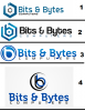
 )
)