Fab's AutoBackup 7 Pro - a must have tool for techs

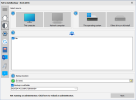
@fabs Isn't "this operating system" selected in your screenshot? The 3rd box has a populated list of accounts so I'm assuming it is. It doesn't look highlighted to me, unless the blue Windows logo is your idea of it being highlighted. Does the blue Windows logo appear over the "other drive or old install" icon if you click on that?
 
@fabs Isn't "this operating system" selected in your screenshot? The 3rd box has a populated list of accounts so I'm assuming it is. It doesn't look highlighted to me, unless the blue Windows logo is your idea of it being highlighted. Does the blue Windows logo appear over the "other drive or old install" icon if you click on that?
It looks like I need to remake those so that would be more obvious
 
Isn't "this operating system" selected in your screenshot?

Yes, it is. Only the things in "full, living color" are selected. "This computer" in box 1. "This operating system" in box 2.

Grey ghost icons are unselected. Note that for "This operating system" even the part of the icon that represents the drive light is green, and un the unselected one its still in shades of gray.

I imagine it's even possible that if "This operating system" were not selected that the windows overlay could disappear, but it's more likely that it would be greyed-out, too.

I also prefer a strong outline in some color, around activated buttons, but that's becoming more rare now. The "color state" of the button is the indicator.
 
It looks like I need to remake those so that would be more obvious
Yeah, I would. If you don't want to use color then maybe you could reduce the opacity of the icon that's not selected. Or make the entire box that's selected blue or highlighted or something. I don't know. You gotta do something.

Yes, it is. Only the things in "full, living color" are selected.
I see that now but it's not very obvious. If you hadn't pointed it out I probably never would have noticed. If the drive icon wasn't grey to begin with then it would be a lot more obvious but going from grey to black and white is so subtle. Just having that green indicator light and a Windows logo (that doesn't exist on the other icon) isn't enough to tell at a glance that the other one is in black and white.
 
Yeah, I would. If you don't want to use color then maybe you could reduce the opacity of the icon that's not selected. Or make the entire box that's selected blue or highlighted or something. I don't know. You gotta do something.
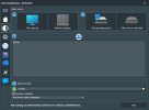
1686899712648.png1686898092205.png
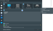
Is that better ?

Here's how it looks like if another drive is selected :
1686908011552.png
When clicking the "Other drive or ols install" button, a popup menu shows up. When choosing an item that's actually a drive mounted on the system, a checkmark is added on it and the "Other drive or old install" button's label is changed to match the menu selection. If the "This operating system" button is clicked again, the "Other drive or old install button's label switches back to its original name.
 
Last edited:
@fabs Yeah that definitely looks better but it's still not really obvious at a glance. It would probably take me a few seconds to realize that the colored icons were active. Making the box itself a different color when it's selected would be a lot more obvious. Obviously if you want to use blue you'll have to get rid of the blue color on the monitor and the blue Windows logo color but honestly you'd be better of with grey icons (not greyed out but like the selected icon on the upper right on your last image) with the only difference being the box that's selected will either be outlined or the box itself filled with a different color.

EDIT: Actually it's pretty obvious that the "This operating system" box is greyed out but only because of the grey Windows logo. If the selected icon (in the upper right corner of your last image) was greyed out, it wouldn't be obvious at all because it's a grey hard drive. If you were to replace that icon with something that wasn't grey, you might be able to get away with just greying it out.
 
I have to disagree here that the use of "primarily grey" icons with an outline would be better.

I still like the idea of a bright outline on any selected control as it does make it easier to see, and in a piece of software like this it can be an "opposite side of the color wheel" to the primary background to make the fact that it is selected very obvious.

But in the absence of that, the use of "full color" icons for selected controls versus grayscale icons for unselected ones is perfectly obvious, and in pretty common use elsewhere.
 
@fabs Yeah that definitely looks better but it's still not really obvious at a glance. It would probably take me a few seconds to realize that the colored icons were active. Making the box itself a different color when it's selected would be a lot more obvious. Obviously if you want to use blue you'll have to get rid of the blue color on the monitor and the blue Windows logo color but honestly you'd be better of with grey icons (not greyed out but like the selected icon on the upper right on your last image) with the only difference being the box that's selected will either be outlined or the box itself filled with a different color.

EDIT: Actually it's pretty obvious that the "This operating system" box is greyed out but only because of the grey Windows logo. If the selected icon (in the upper right corner of your last image) was greyed out, it wouldn't be obvious at all because it's a grey hard drive. If you were to replace that icon with something that wasn't grey, you might be able to get away with just greying it out.
This is a difficult one...
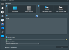
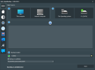
The fact is that I cannot change the "Box" background as this not a box but a button with embedded graphics. Buttons background cannot be changed. So, since the blue windows logo that turns grey when not selected seems to be acceptable, I've added a green (when selected) USB logo to the "Other drive" button. I hope this time, that will be obvious enough.
1687018744011.png

1687018776509.png
 
I curse day when "the flat look" took over the entire UI world, not only for myself, but for the vision-impaired clients I work with.

The old Windows Aero look with the 3D buttons, window frames, etc., was just so much easier to visually distinguish "states" under. I'm actually shocked that the flat look has lasted in the way it has.
 
It's almost intuitive.

I know what you mean. And if it's not truly intuitive, all of my training on all sorts of platforms with GUIs over the course of decades has exposed me to "greyed out"/"stippled out" as meaning either not selected or not available for selection, depending on the context.
 
  • Like
Reactions: GTP
@fabs I'm sure the Backup option used to allow typing in a destination folder name that doesn't yet exist, but for a while now it only enables Next if that folder exists. Very annoying, having to Browse and press New Folder etc every time when I know the drive letter and folder name I want.

Surely Autobackup Pro could simply create the specified destination folder if it doesn't exist?
Fab's has always worked like this : it will not enable the "next" button if no user profile is selected as source AND if destination folder does not exist. So, it has never created that folder on its own.
Since this is annoying, I'll try to do something about that like enabling that button if the typed drive or network share exists but no further check.
 
Question on Wireless networks. In my memory somewhere I thought at one time when doing a FABs on a machine and restoring to the new machine it would automatically transfer all know wireless networks and passwords so the machine would automatically connect to those. I just did a transfer last week with a fresh download of FABs and restored to the new machine but the only wireless network was the one I had already created on the machine before the restore.
Is my memory wrong and this was never done in the past or did it just not work?

Thanks
This part is done using Nirsoft WirelessKeyView. If this one has been stopped for any reason (anti-malware solution while backing up or restoring), this may explain why they were not reimported in this case.
 
Back
Top