Fab's AutoBackup 7 Pro - a must have tool for techs

Very nice! Did you design it yourself or did you pay someone to do the design? How does branding work in version 8? It's not the end of the world if I can't add my logo anymore but it was kind of a nice feature even if it's just at the home screen. Speaking of which, what does the home screen look like? Or is the home screen the "backup data" screen? Any idea when the release date of version 8 will be?
I've designed it myself, mostly based on Windows 11 build in icons and simple items such as regular buttons instead of colored panels. It makes the design simpler. I'm struggling a bit making the app DPI aware to make it still look good if pixel per inch value is different than 100%.
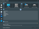
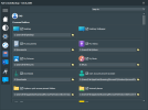
Detected items will be drawed on the fly so, only the ones that are effectively there will appear. The program will grab their icons on the drive. If it cannot do that for one reason or another, it will pick one in an internal icon bank.
Here's a sample of of how that looks on my system. I have also redesigned left menu icons as I did not have high PDI versions of them:
1685695393788.png
1685695870116.png
I'm experimenting a "jump to" menu so, even if all users and public items show on the same scroll box, it will be quick and easy to reach them.
I'm not done with designing this screen yet (there are some missing buttons). I'm also thinking about putting the items scroll box and "jump to" menu at a higher position one this screen so more items will be visible at one sight.

I've not designed it with branding in mind to be honest. What is sure is that it will still be possible to brand the app name and the logo could be on the about window as there's no room for that anywhere else. Thinking about it, it may not be worth the hassle for anyone to crop and design a logo and have it only on the about screen. That would just be some kind of "polish" so, I may put it there anyway for the ones who want to use it.

The landing screen (aka home screen) IS the backup data screen. It will be quick to switch to restore and transfer mode using the menu on the left.

Finally, I don't have any idea about any release date as for now, I'm still working on design and items detection. I don't have started coding how they will be processed. There is still a LOT of work on this new version.
 
@fabs Well I know you said that you weren't very good at design but when you try you can make something very pretty! I like the "jump to" dropdown but there's still a lot of scrolling required. You might want to make each field (ie "desktop" "desktop wallpaper" my documents" etc.) 50% of the viewable area so you can put them side by side. That will reduce the scrolling requirement by 50%. Most user's default path is quite short so I wouldn't worry about that text box being half as long as it currently is.

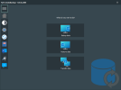
And I highly suggest creating a home screen where you can access basic functions without having to open the hamburger menu and where you an add your logo if you want to. The hamburger menu will still be very useful as a quick way to switch functions without having to hit the back button 20x to return to the home screen. The home screen should have a place for your logo and then the three options ("backup data" "restore data" "transfer data") just like the home screen in version 7 but you can use the modern design/icons to make them three square boxes side by side instead of rectangles that are stacked like Version 7.

If you want you can even add a bar at the bottom with links to the other functions like "settings" "check for updates" etc. Usability wise you did a good job with Version 7's home page. I don't like having to go through menus to find a function if it can be right there on the home page. Even though it's only one extra click when I go to restore data, I think it would be better to allow people to choose the function at startup just like you do now in Version 7.

I love the design. I just want to make sure it's efficient and easy to use too. Having to scroll through twice as much stuff just because it's taking up 100% of the width of the program for no reason is annoying. Having to go into a hamburger menu every time I want to select a function other than "backup data" is annoying.

I'm also thinking about putting the items scroll box and "jump to" menu at a higher position one this screen so more items will be visible at one sight.
Yeah that would be my suggestion. That's just wasted space up there.
 
@fabs Well I know you said that you weren't very good at design but when you try you can make something very pretty!
Thanks. I'm putting a lot of efforts in this as I'm tired to see comments like "it's ugly but at least it's functional" ;)

I like the "jump to" dropdown but there's still a lot of scrolling required. You might want to make each field (ie "desktop" "desktop wallpaper" my documents" etc.) 50% of the viewable area so you can put them side by side. That will reduce the scrolling requirement by 50%. Most user's default path is quite short so I wouldn't worry about that text box being half as long as it currently is.
That would complicate a bit how visual items are dynamically generated. Then I would have to set item generation with a row handling switching between row 1 and row 2. That seems doable with a bit of work. I could also try to add some expand/collapse button to show or hide detected path so item boxes would be thinner.

And I highly suggest creating a home screen where you can access basic functions without having to open the hamburger menu and where you an add your logo if you want to. The hamburger menu will still be very useful as a quick way to switch functions without having to hit the back button 20x to return to the home screen. The home screen should have a place for your logo and then the three options ("backup data" "restore data" "transfer data") just like the home screen in version 7 but you can use the modern design/icons to make them three square boxes side by side instead of rectangles that are stacked like Version 7.
There's actually no need to open the hamburger menu to click on of the buttons.
That said, if a real home screen like the one in 7 is preferred, then I would remove the 3 options from side menu and replace them with a "home" button. Then I would put the 3 buttons onto a home screen where it would be possible to put a logo like in 7 ;)

Yeah that would be my suggestion. That's just wasted space up there.
Well, I just did as soon as I posted the message :)
 
That seems doable with a bit of work. I could also try to add some expand/collapse button to show or hide detected path so item boxes would be thinner.
Yeah I think that's a great idea. The less scrolling the user has to do the better.

There's actually no need to open the hamburger menu to click on of the buttons.
Oh really? I didn't realize that. Still, you have to click the hamburger menu for the icon labels to show. I think it would be better/more intuitive to have a home screen like in Version 7.

if a real home screen like the one in 7 is preferred, then I would remove the 3 options from side menu and replace them with a "home" button. Then I would put the 3 buttons onto a home screen where it would be possible to put a logo like in 7 ;)
Yeah I think that would be really nice!
 
I think it would be better/more intuitive to have a home screen like in Version 7.
I don't really agree. It's a change that we'd need to get used to but it's more efficient without the home screen. There could be a 'simple' mode with a home screen, and 'advanced' mode that skips that.
 
A home screen allows for branding and an easy way to select which mode you want to be in at every start. I don't like the software just kicking me into the "back up data" screen at startup when I'm trying to restore data on a client's PC. It makes no sense.
 
I only use it internally
So do I but I'd prefer to have my logo on the program if a client sees it. It seems more professional to have branded software. I've custom branded other software that I use as well.

efficiency
How is it efficient to have a software automatically throw you into a mode you don't want to use? That would be like Windows automatically launching Edge at startup with no way to turn it off. Maybe I don't want to use Edge the first thing I do when I start Windows (or ever hopefully). Yeah you can just close it but why do that in the first place? Windows starts at the desktop for a reason.
 
A home screen allows for branding

Why is this an issue? To my knowledge, this is not a tool that has ever allowed such, nor would I think it should.

We're not buying this to hand out to clients, or at least I have not heard anyone saying they've done so in the past. It's a tech tool and the brand is Fabs, and only Fabs.
 
I'd prefer to have my logo on the program if a client sees it. It seems more professional to have branded software. I've custom branded other software that I use as well.

If Fabrice wants to support this, I certainly have no objection. But I have not seen anyone, save you, bring it up before. It's certainly not a need I have, but that's not what dictates what any developer should use as their sole metric of what they'll do (or not do).
 
To my knowledge, this is not a tool that has ever allowed such, nor would I think it should.
Then apparently you never read the manual. Branding has been available for as long as I've owned the program. Most programs aimed at professional service providers are brandable. My mechanic's shop's software is branded as is my vacuum service and sales store.
 
Branding has been available for as long as I've owned the program.

Then you appear to be asking for something that already exists. Unless it's that it doesn't allow a logo placement.

In the end, this would likely be very, very far down the priority list.

I doubt that your clients pay the least attention to whether or not your logo and name appear on the tools you use. I certainly don't when I use other service providers. Stuff and nonsense.
 
I doubt that your clients pay the least attention to whether or not your logo and name appear on the tools you use
You would be surprised at how "nosey" some clients can be. If they think they can get the tools you use, then they could fix it themselves for free.
I have experienced this very thing and found various "free" versions of programs that I regularly use that require a technician license, on client machines.
Those home visits when the client is seated beside you and they "pretend" like they're not looking. They are.

Not all end users are the same, some will seize any opportunity if it means they can save a few dollars.
Unless it's that it doesn't allow a logo placement.
I use my business name/logo on Fabs and have done since I've owned it as well.

Although I'm now retired I still use Fabs Autobackup occasionally.

@fabs Thank you for all the years of trouble free client data backup/restoration. The time savings and peace of mind using Fabs Autobackup was more than worth the license fees. :)
 
Those home visits when the client is seated beside you and they "pretend" like they're not looking. They are.

Well, this is where practices differ, too. I invite my clients to sit and watch if they so choose. I consider that I am there not only to offer a service, but to educate. And if I've got a particularly tech talented client who wants to try DIY next time, so be it. It seems that relatively few go the DIY route, but they appreciate being able to watch if they want to.

But what I really mean is that I doubt that those same clients are any too impressed by whether your name and logo appears, or not. And there's no way to settle that, nor to change my opinion.

But now I'm more confused than ever since it appears what's being asked for has already been an option with Fabs for quite some time.
 
I invite my clients to sit and watch if they so choose. I consider that I am there not only to offer a service, but to educate.
I set up a new computer remotely today with data transfer. What should have taken 2-3 hours max took 5 since the user kept questioning me on every other thing. Spoiler alert, I do not charge by the hour. Never have. If I charged by the hour, the charge would have been more than the computer cost and would not have any business.
 
  • Like
Reactions: GTP
Well, this is where practices differ, too. I invite my clients to sit and watch if they so choose.
As do I, but you do get the cheeky ones who will try to save a few dollars.
I just remembered a couple of instances whereby I had to transfer some "paid" tools to a clients desktop to run them from a remote session. They were convinced thatnow they were on their desktop that they now "owned" those tools and were disgruntled when I removed them.
 
Exactly why I had a "flat fee" for workshop. I always explained that if an onsite job was going to take more than a certain time I would have to take it back to the workshop.
When the charge started to get too high they would complain about it.
People are cheapskates and jump at any chance to save money.

Part of the reason I stopped doing onsite too. When I told them that "by the time I charge travel and a per hour" that it would be much cheaper for them to bring it to me. Also, I could do other work as well.
 
It really is fascinating to see how diametrically opposed practices and opinions are in terms of how we each choose to do business, much of which is based on personal preference.

I absolutely, positively have never, ever, wanted to do any "flat fee" work because every blessed job ends up having "unexpected stuff" turn up, often because of "Oh, by the ways," coming up during that were never mentioned before.

And I, myself, far, far, far prefer doing onsite work. The reasons are stated on the homepage of my website:
"Many issues occur due to something specific about the way computers and other electronic devices are set up where they're being used. Because of this, I've learned having someone bring them to me is frequently not the best way to work out technology problems. Often what's making you want to tear your hair out is the result of a formerly perfect setup that now requires some changes. This is why I prefer to help at your home or office when that's possible."

Different strokes for different folks.
 
  • Like
Reactions: GTP
Back
Top